 |
||
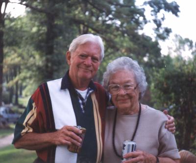
| Bud and Gwen Kettler, 1997 | ||
| Designer of Courier: the Bud Kettler Page COURIER is the world's most well-known typeface, but little is known about its designer, Howard G. (Bud) Kettler who died in September, 1999 at the age of 80. Kettler's long career began at IBM in 1955 and continued into the 1990s, way past retirement, with Lexmark, the spin-off company formed from IBM's printer and typewriter business. If crystal goblet type design is your ideal, then surely Courier is the most successful of all monospace typefaces. Comparing it to other monospaces, it seems to me to have vastly more even color in the greatest proportion of letter combinations, and the highest degree of what we might call 'scansion', borrowing a term from literary analysis, and which we might define for typography as the measure of ease by which lines of text can readily be scanned. Although there is no formal biography, several of Mr. Kettler's co-workers have contributed informal reminiscences which are printed below by permission. |
||
| By Roger Roberson I first met Bud in May of 1958. I was a still wet-behind the-ears kid just out of high school. Bud had moved to Lexington with his family from Poughkeepsie a year or so before. My job was to make art work for the type available catalog. Bud was a great teacher and mentor in the 24 years that I worked with him. Bud started to work for IBM in 1952. His background was running a small town newspaper and later owning a print shop. He had the type and font knowledge that IBM was looking for at that time, and was hired on his interview. Bud designed Courier in 1955 for the type bar typewriter and when the Selectric was created Courier was adapted for the type ball. Some serifs were shortened and the numerals were narrowed. I don't know how many Courier type elements were made but it had to be in the tens of millions. Bud also designed the Advocate type style for the Selectric. He was always working on a font design in his spare time. One such idea which proved to be popular was the symbol fonts that he created for the Selectric. He then had to sell management and the planning department on the idea that the world was waiting for these fonts. Bud was one of the most creative persons I've known, and not only with letter shapes and font design. One of his jewels was the "Car" he built out of type elements, type bars, ribbons, spools -- all type-related parts mounted on a walnut base. He had it at work, showing it off, and one of the management team saw it and wanted a copy. And then another was needed for an executive returning home from a Lexington assignment. By then Bud was getting tired of being in the car business. He was asked to make just a couple more and was told to "take a couple of days off" to build them. After that he put his foot down at requests for more. He said they were out of production. One thing I liked, and it showed Bud's humor, was the bumper sticker on the cars. At that time we were converting to metrics and Bud had put "Metrics Hell--I won't give an Inch." |
||
 |
||
| By Jim Derrickson I first met Bud in June of 1965, when IBM hired me. He was of medium height; a stockily built, very personable individual with sometimes continuous hilarious quips. At that time he was about forty-five and a widower with a bevy of four young daughters. His second wife Gwen was possibly the perfect match to fill the void left in Bud's life. She inherited a ready-made family, which they shared for some thirty-three years. His usual accessories were the pipe, which he seldom lit, and the little alpine hat he wore in winter. These along with his reddish complexion and the sheepish smile made him look more like a beloved leprechaun rather than the Germanic conqueror, which his name might imply. He was one of the three or four people I have met that I thought had an unusual natural sense of humor for quips and timing for the moment. He usually kept me in stitches. Since Bud was in the US Navy in WW II, he had several, usually funny stories. The one I remember best is when he was in an English pub enjoying a warm beer. It seems that an English soldier had proposed a toast to the Queen, when a drunk GI suggested an alternate toast to Her Majesty. Of course this led to a brawl. I asked, "Did you wade in?" "Hell no, I was minding my own business when they started that. I grabbed my beer, and crawled out of there." I did not know that Bud was a pack rat until some years ago, when he escorted me through his second story office where he stored his collection of plaques, and memorabilia. There I saw a plaque that I had not seen in twenty years. It had been designed (with my mistake on it) to present to the person that made a major design mistake, and passed to the person who made the next one. I was the first, and possibly the only recipient. He did not understand that it was my plaque to destroy. I always thought of Bud as a friend and nothing less. My final tribute to him is: THIS WAS A PERSON WORTH KNOWING, AND I HAD THE PRIVILEGE TO HAVE KNOWN HIM |
||
| By Paul Rainey What a man. I never dreamed I would ever be writing this note. Bud was the go-to man, if you needed help or advice on a particular font or character. Bud could take your problem and show you the answer in such a way that you had the greatest respect for him. He never belittled or made fun of your designs. Bud is known for his design of Courier, but he did much more than that. The font that Bud designed for IBM that he was most proud of was the Braille font for the IBM Braille Writer. On this project he had to work very closely with the mechanical engineers to get the Braille characters to emboss the paper such that a blind person could feel the typed image and read it. Bud got a big kick out of doing something for someone else. The fonts that Bud had the most fun with were the fonts he designed for what Bud called the Pizza Printer. The Pizza Printer had a print disk about twelve inches in diameter with the upper case and numbers in the outer ring and the lower case and sorts in the inner ring. IBM eventually sold this technology to someone else. Bud worked with Adrian Frutiger on fonts for the IBM Selectric Composer. Frutiger was very good but Bud had to help him through some technical problems. The upper case M and W of Frutiger's design were too bold for the limited impact from the type element. Bud decided he could cut down on the surface area without cutting down on the surface size. Bud did this by redesigning the M and W with a series of lines that would resemble a plowed field in a shallow pyramid pattern. The ribbon that was impacted by the modified M and W would spread across the furrows on the face of the characters and make them appear on paper as solid characters. Bud was involved with fonts and art all his life. Before coming to IBM, Bud ran his own printing shop. IBM gave Bud many challenges in the area of font design. He completed all his tasks in a superior manner. Bud adapted his designs to the manufacturing capabilities of the time. When he started designing for IBM, we designed our characters at 100 times their actual size by first drawing the characters and then cutting into cardboard to give the engraver a pathway to follow. Bud would take these 100X patterns and place them next to each other to see how they would look. He would stand back quite a distance with his pipe in the corner of his mouth and mutter something about how they looked. Many times he would make an actual size mock-up of the font--about half a page worth. He would study the design many ways. One thing he did that no other font designer did was to rotate the mock up page a full 180 degrees. I asked him why he did that. His answer was that he wanted to make sure that no one character stood out. He explained that font designing was meant to be invisible to the reader. He said the reader should not be conscious of characters and just see words. When Bud retired from IBM they asked him to come back and do some digital font designs for them. Even at retirement age Bud was still faster that any other designer. Bud laughed and joked a lot really enjoying his work. He never got mad or raised his voice. Bud understood life and made the most of it. He had his priorities in the right order: his family came first. Everyone who knew Bud loved him. I loved Bud Kettler. |
||
| By Jack Malley My name is Jack Malley (an IBM retiree, Type Designer and Print Quality Consultant). I was asked by Mark Robb (Senior Engineer of Font Development Engineering for Lexmark International, Inc.) to contribute some memories I have about a fellow colleague of mine, Howard G. "Bud" Kettler, a Master Type Designer and IBM retiree, most remembered for designing the typestyle COURIER. In 1966, as a new IBM hire, I was introduced to many employees, three of whom influenced my career for 30 years -- Howard G. Kettler, Roger W. Roberson and James R. Derrickson (all three Master Type Designers). Two days ago Mr. Kettler died, and with him went a considerable amount of the history and development of IBM's typestyles. There were literally hundreds of typestyles developed in house to support the many printing products released by IBM. Mr. Kettler was the designer of many of those typestyles, and was the working manager of IBM's Type Design. Of the many typestyles Mr. Kettler designed, Courier was chosen by the world as its favorite. Courier was subsequently shipped with every Selectric Typewriter sold to the public. Even today, Courier retains it's popularity as the most desirable monospaced font. Mr. Kettler was quoted in Aldus Magazine about how the name evolved. The font was very close to being released with the name "Messenger". After giving it some thought, Mr. Kettler said "A letter can be just an ordinary messenger, or it can be the courier, which radiates dignity, prestige, and stability." Thus, the name Courier. In the late 1960s, it became necessary to provide extensive training for the new Type Designers of the day (including myself). For that task IBM turned to Howard G. Kettler. Mr. Kettler personally developed a Type Design tutorial book, gave us individual lessons (as needed), and had weekly "graded" tests. He scheduled Type Design experts from around the world to lecture us at the University of Kentucky, on the history of text imaging and calligraphy. He climaxed his Type Design training course by arranging for one of the world's most famous Type Designers, Adrian Frutiger, to come to Lexington for two weeks and train our department on the fundamental elements of character design. Mr. Kettler traveled the world for IBM, clarifying customer requirements pertaining to Font Design and Keyboard requirements. In addition, he worked closely with the Federal Bureau of Investigation, The Royal Canadian Mounted Police and various other Questioned Document Examiners. His efforts with those groups remain confidential. I can't remember Mr. Kettler's exact retirement date! However, I do remember that shortly after his retirement he was asked by IBM to return to continue designing typestyles. He returned, adapted to the computer technology of the day, and quickly delivered several new Hebrew and Arabic fonts for use on IBM's 4019 and 4029 Laser Printers. After Mr. Kettler's last stay with IBM, I asked him, "Bud, what are you going to do during retirement?" He replied, "Jack, the first think I have planned is to design my own headstone, in a new typestyle." I asked him "What will it say?" He replied, "You'll have to come visit me to find out!"
|
||
 |
||
| Home | |||